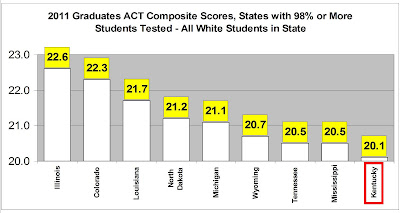
How do the new ACT Composite Scores compare across states with high participation?
Yesterday, I posted information from the ACT about the percentages of white and black graduates in 2011 that were fully prepared for college. To keep that comparison fair, I only looked at states that tested 100 percent – or nearly 100 percent – of all 2011 high school graduates with the ACT college entrance test.
Today, let’s look at the 2011 ACT Composite Scores by race for those same states.
The first graph shows the very disturbing news about how our whites compare to whites in other high ACT participation states. Data in this and the next graph come from the individual ACT Profile Reports for each state.

Note that even Mississippi’s whites beat our kids.
Keep in mind that Kentucky’s graduates were 79 percent white in this ACT test group. Only North Dakota had a higher white percentage (83 percent). Six of the states shown here had white percentages more than 10 points lower than Kentucky’s. Four states had white percentages more than 20 points lower. Thus, the dominant racial group in Kentucky was outscored by their counterparts in every other state in the graph.
It’s these demographic differences that explain how Tennessee scored 0.1 point lower than Kentucky in the overall ACT Composite Score for all students but exceeds our performance by 0.4 point for whites.
That brings up an important point. Because whites score a lot higher on the ACT than every other group except Asians (who represent very small proportions of students in most states), Kentucky does get a strong, and unearned, advantage in any comparison of overall ACT scores. The problem is the same as the one I have often discussed concerning the National Assessment of Educational Progress.
Hence, it’s important to disaggregate scores to see what is really happening in our education system.
The news is better, in a way, for our black students.

Kentucky ranks in the middle of the pack here. However, blacks in all these states trail whites significantly. Even blacks in top-performing Louisiana trail whites in the lowest performing state, Kentucky, by 2.6 points. That’s a very big difference on the 36-point ACT.
The second graph does show that Louisiana, a major charter school state that rebuilt its Hurricane Katrina shattered gulf coast area schools with many new charters in the mix, clearly is doing a better job with these children of color.
And, Louisiana has a lot of blacks in its system, 32 percent of all 2011 graduates versus just 9 percent for Kentucky. Louisiana’s Class of 2011 is only 57 percent white.
If you have more questions about why I only look at states with high participation rates on the ACT and why I break this out by race, click the “Read more” link below. Or, use our comment feature to ask a question or make an additional observation.
As touched on above, part of the problem in comparing education programs from state to state involves Kentucky’s very unique student demographics. Those can be extracted from several sources including the ACT, Incorporated’s “The Condition of College and Career Readiness” reports for each state.
We can get more information from the Data Explorer for the National Assessment of Educational Progress (NAEP).
These sources tell us that Kentucky is:
• Heavily white (about 79% per ACT in 2011),
• Very low minority population (about 9% black and very small percentages for other races per ACT) and
• Relatively high poverty (50% per the 2009 NAEP based on school lunch eligibility of fourth graders who took the reading assessment, though 14 states had even higher poverty, including Louisiana with 70% poverty).
Also, our former state testing program was Kentucky-unique – CATS could not be compared to results from any other state.
Even with the NAEP, demographic differences make valid comparisons challenging, as you can discover here.
There are additional things to consider in comparing Kentucky’s performance from the ACT college entrance test to performance in other states.
Aside from those issues cited above, all graduates from Kentucky’s public schools now take the ACT at least once, while in other states participation in 2011 varied dramatically from a low of only nine percent in Maine to 100 percent in Kentucky and seven other states. Adding to that situation, the data available from the ACT, Incorporated averages together results for all students in each state: public, private and home school.
As I showed earlier with a Kentucky example, the public school only performance in any state could be different from the overall averages. This makes it more difficult to extract valid conclusions about KERA, for example, from the data released by ACT.
As a consequence of all of this, when the ACT, Incorporated compares college readiness information for Kentucky to the national averages, we need to consider that the comparison might put our state to a disadvantage. Nationwide, most students self-select to take the ACT, and only about half the Class of 2011 chose to do so. Comparing scores for only the top half of the class nationwide to scores for Kentucky where virtually all students took the assessment isn’t going to give us a highly accurate picture.
On the other hand, as discussed above, Kentucky’s very high white population coupled with the fact that whites notably outscore other racial groups on academic tests (except the relatively few Asians found in most states) gives Kentucky an unfair advantage when we only look at overall scores for the ACT high participation rate states. For a complete picture, you have to disaggregate the data by race.
The bottom line here is that we need to do something to kick our schools into a higher gear. We’ll have more to say about that in about one more week.