How does college preparation in Kentucky compare to the rest of the nation?
We always get questions about how Kentucky’s education system compares to the rest of the nation. Often, that isn’t such a simple question to answer well.
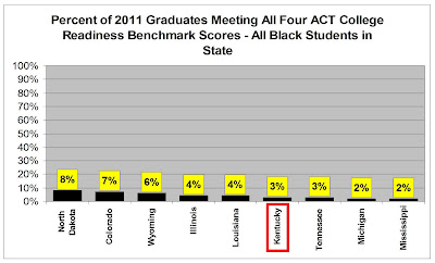
However, here are some comparisons of the percentages of white and black high school graduates that scored above the college readiness benchmarks in all four ACT tested areas in 2011. To get a reasonably fair comparison, I only show states that had very high participation rates on the ACT (98 percent in North Dakota, 100 percent in the rest).
The first graph shows how our whites compare to whites in other high ACT participation states. Data in this and the next graph come from the individual ACT Profile Reports for each state.

Notice that even in top performing states like Illinois and Colorado only about one in three graduates was fully prepared to enter a liberal arts college program. In Kentucky, less than one in five graduates was adequately prepared for a liberal arts program in a typical US college.
Now, here is the depressing information on black preparation.

As you can see, even in the top performing states in this graph, fewer than one in 10 black high school graduates from the Class of 2011 was adequately prepared for a typical liberal arts college program.
In Kentucky, fewer than one out of 20 blacks were fully college-ready.
You might wonder why I only look at states with high participation rates on the ACT and why I break this out by race.
Click the “Read more” link below to find out.
Part of the problem in comparing education programs from state to state involves Kentucky’s very unique student demographics. Those can be extracted from several sources including the ACT, Incorporated’s “The Condition of College and Career Readiness” reports for each state.
We can get more information from the Data Explorer for the National Assessment of Educational Progress (NAEP).
These sources tell us that Kentucky is:
• Heavily white (about 79% per ACT in 2011),
• Very low minority population (about 9% black and very small percentages for other races per ACT) and
• Relatively high poverty (50% per the 2009 NAEP based on school lunch eligibility of fourth graders who took the reading assessment, though 14 states had even higher poverty, including Louisiana with 70% poverty).
Also, our former state testing program was Kentucky-unique – CATS could not be compared to results from any other state.
Even with the NAEP, demographic differences make valid comparisons challenging, as you can discover here.
There are additional issues to consider in comparing Kentucky’s performance from the ACT college entrance test to performance in other states. Aside from those cited above, all students in Kentucky’s public schools now take the ACT, while in other states participation in 2011 varied dramatically from a low of only nine percent in Maine to 100 percent in Kentucky and seven other states. Adding to that situation, the data available from the ACT, Incorporated averages together results for all students in each state: public, private and home school.
As I showed earlier with a Kentucky example, the public school only performance in any state could be different from the overall averages. This makes it more difficult to extract valid conclusions about KERA, for example, from the data released by ACT.
As a consequence of all of this, when the ACT, Incorporated compares college readiness information for Kentucky to the national averages, we need to consider that the comparison might put our state to a disadvantage. Nationwide, most students self-select to take the ACT, and only about half the Class of 2011 chose to do so. Comparing scores for only the top half of the class nationwide to scores for Kentucky where virtually all students took the assessment isn’t going to give us a highly accurate picture.
Still, if you still want to see those somewhat “apples to oranges” comparisons the ACT, Incorporated has assembled, you’ll find them in “The Condition of College and Career Readiness | 2011 – Kentucky.”
To reiterate, the presentations are interesting, but they must be considered with some caution.
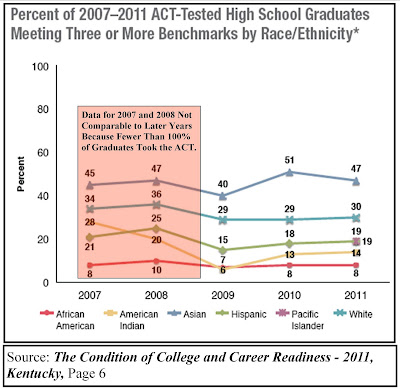
I think there is more value in the presentations that only compare Kentucky to itself over time since 2009, the first year all of our graduates took the ACT. Here is one of those graphs, which covers only Kentucky, with the pre-100 percent participation years shaded out because that data isn’t fairly comparable to the more recent figures.

As you can see, the percentages here are all quite low, and these only show the percentages meeting three out of four – not all four – college readiness benchmarks.
Furthermore, the progress over time is very slow, as well.
Clearly, we need to do something to kick our schools into a higher gear.